

CLIENTS
About Bea (she/they)

Born in Hong Kong and raised in California, I’ve always sought communities that embrace intersectionality within the arts and education. While pursuing my B.S. in Design & Industry at San Francisco State University, I became deeply involved in activism through the Asian Student Union and the city’s historic drag community—spaces that shaped my creative values and collectivist-driven ethos. I believe that the perfect blend of creative and accessible function lies in the power of tactile storytelling; where visual design leaves a lasting emotional and sensory impact.

Outside of full time roles, I’ve worked as a Teaching Artist and contributed to Diversity, Equity, Inclusion, and Belonging (DEIB) councils and Employee Resource Group (ERG) initiatives. In May 2024, I founded Queer Life Drawing Collective while simultaneously stepping into my role as a Board Member at Positive Images–all reflections of my unwavering commitment to community, inclusivity and creative liberation. My work has always been grounded in community care and uplifting human dignity; empowering others to live authentically and challenge systems through art and advocacy.
Recommendations
“She is truly dedicated to her craft and always put in 110% to make sure each project was the best it could be. In the time that I worked with her, she helped to support the team, built strong relationships and streamlined processes. Bea has so much technical skill + knowledge, I could always trust her to find a way to make IT happen; whatever it was, she was on it. Still she looked for ways to grow, educated herself to stay up to speed in the industry. It was a complete joy to work with her and I know she will only continue to get better!” — J. Cotto, Packaging & Art Director“Bea brought incredible energy, passion and dedication to work everyday. In addition to her role as a Brand Designer, Bea spearheaded the company’s first-ever Pride Campaign - she executed the marketing communications, developed a partnership and charitable donation to The LGBT Asylum Project and organized an internal webinar to educate the team on the nonprofit’s mission and impact. Bea was also closely involved in shaping the direction and strategy of DEI initiatives and made a lasting impact during her time with the company.” — M. Li, VP of Marketing“Bea shared her talents as a Package Designer and Artist with young folks at the Sonoma Community Center through classes and camps for teens. Her lesson plans were extremely professional and well thought out. She was able to convey ideas in succinct and efficient ways while letting them have full creative freedom with the projects. Being able to adapt to each kid's needs is an unique quality that she possesses; the students have been extremely lucky to be able to learn from and connect with Bea." — L. Bakkar, Youth Program Director
SELECTED FEATURES: You'll see a familiar face in the 2019 Morphe PRIDE Live in Color Collection campaign... It’s not every day that I get to take up space to share my personal story and promote more queer Asian American representation in the beauty industry!
Out Magazine | Tutorial

PRESS: The Press Democrat, a local newspaper published and circulated in the San Francisco North Bay, interviewed me at a local rally to speak about finding support within a small-town community during a time of increased hate crimes against Asian Americans & Pacific Islanders. Read More
case studies
FALL 2024 - BODY CARE CEREMONY.
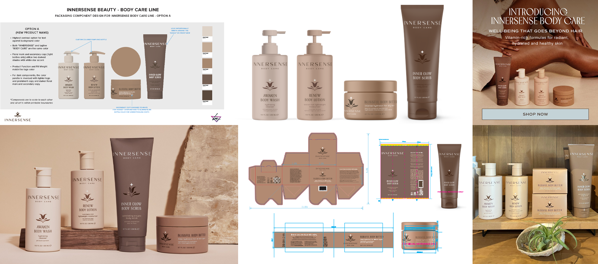
SERVICES - Project Management, Packaging Design & Development, Sustainable Packaging Engineering, Print Production, 3D Rendering, Print Quality Control & AssuranceMISSION - Innersense Organic Beauty expanded their haircare range to include a new line of body care essentials. The brand’s visual identity, originally established by SMAKK Studios, guided me in the rollout of both primary and secondary packaging. The project presented significant challenges, particularly with the complex task of directly silk-screening decoration onto various substrates, including curved PET bottles, jars, and a PET tube with a soft-touch finish. These obstacles required innovative design solutions and meticulous print production management throughout the process.OUTCOME - The final result was a beautiful collection of four custom-color matte primaries complemented with glossy typography, creating a luxurious tactile experience. The packaging exudes a premium feel, mirroring the smooth, silken texture of the body care products inside. Additionally, the collection’s sophisticated color palette aligns perfectly with Pantone’s 2025 Color of the Year, Mocha Mousse, adding an unexpected yet harmonious touch to the design.PRESS - Innersense Organic Beauty Website | Image from Dew Salon | Unboxing from @curlwarehouse
SUMMER 2024 - THE NEW STANDARD OF CLEAN COLOR.
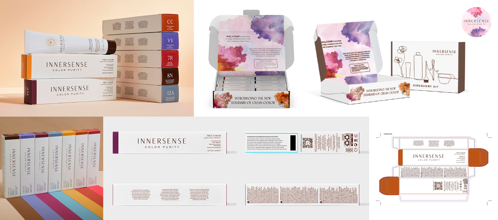
SERVICES - Project Management, Packaging Design & Development, Sustainable Packaging Engineering, Print Production, 3D Prototyping, Print Quality Control & AssuranceMISSION - Innersense Organic Beauty created a professional line of hair color formulations designed for all hair types and textures, free from fragrances and harsh chemicals that can irritate sensitive skin. As a certified B Corporation, the brand’s commitment to sustainability and efficiency made collaboration a true pleasure. I was entrusted with designing the secondary packaging for 41 SKUs, a PR Kit, and various printed materials, allowing me to bring my creative vision and attention to detail to every piece.OUTCOME - The aluminum primary packaging was the only pre-existing element when I joined the project. I designed the secondary packaging using eight distinct color families, paired with a clean, minimalistic serif typeface. The challenge of fitting copy-heavy content onto narrow boxes was addressed with a strategic horizontal layout. For the PR Kit, I introduced a full-bleed watercolor texture beneath delicate line art illustrations (previously developed), adding an element of surprise and delight when the consumer opens the kit.IMPACT - Since launch, the product line has generated over $1M in revenue, with $460,000 earned specifically between May and July. The PR Kit exceeded expectations, selling 300 units within the first month.PRESS - Innersense Organic Beauty Website | @innersensepro on Instagram
FALL 2022 - PLUMP UP THE VOLUME.
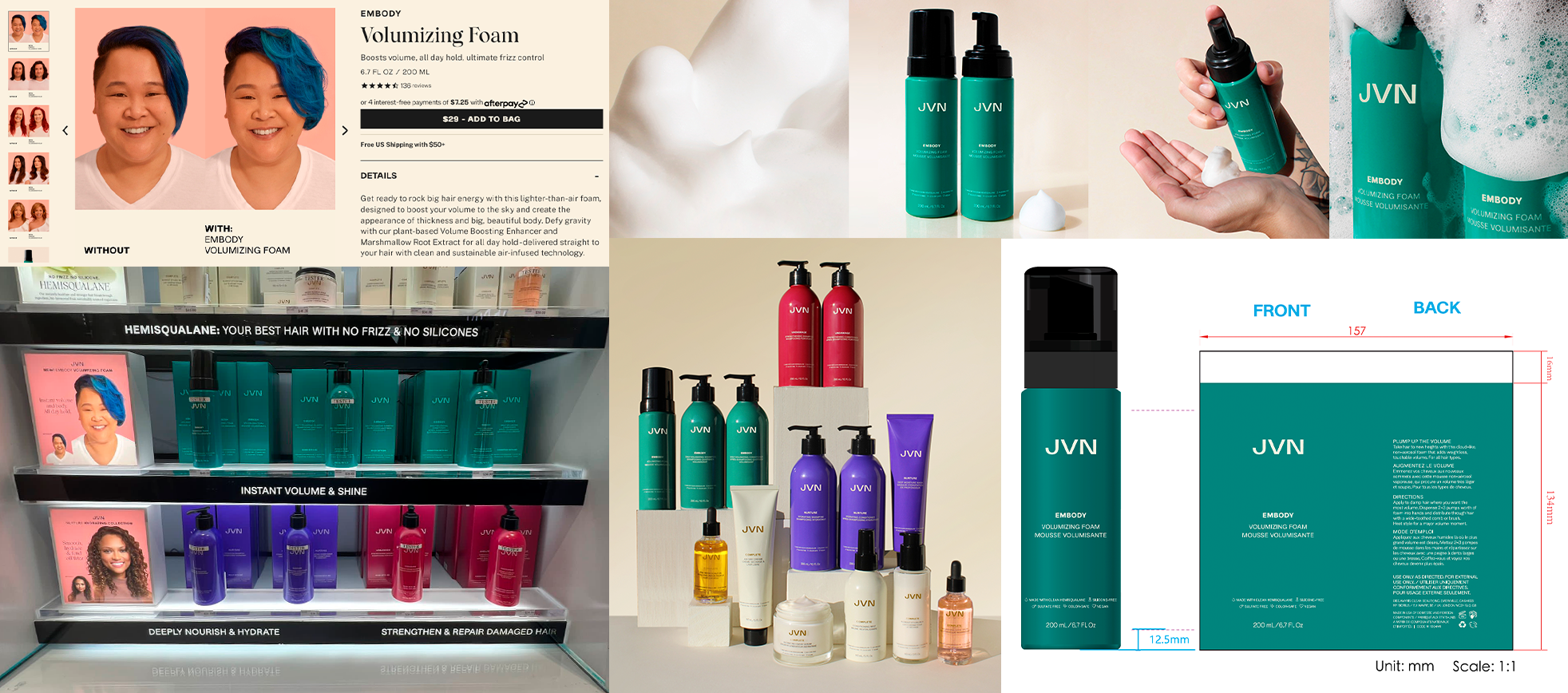
SERVICES - Product Industrial Design, Sustainable Packaging Engineering, Print Production, 3D Prototyping, Print Quality Control & AssuranceMISSION - JVN redefined the traditional mousse with their volumizing foam, designed to create bigger, fuller hair. The challenge was to develop a custom-tooled aluminum primary that would be compatible with an aerosol-free, propellant-free formula, while incorporating a pump made from post-consumer recycled plastic.OUTCOME - I designed the bottle within a framework of pre-established requirements: it had to fit on narrow store shelves, provide an optimal user experience with the right diameter, and seamlessly integrate with the teal Embody line. After multiple rounds of prototyping, color testing, and press trials, we overcame a series of production hurdles. The result was a product that earned rave customer reviews as we rang in the new year.IMPACT - In addition to my behind-the-scenes work on the product, I was chosen as a model to represent color-treated East Asian hair, appearing on displays at Sephora, Selfridges, and other major global retailers. My contributions to the brand’s sustainable and responsible packaging were instrumental in securing our place in Sephora's prestigious “Clean + Planet Positive” collection.PRESS - Sephora.com | JVNHair.com | Kohl's.com | Amazon
SUMMER 2021 - INSPIRE PRIDE. SHOW YOUR LOVE.
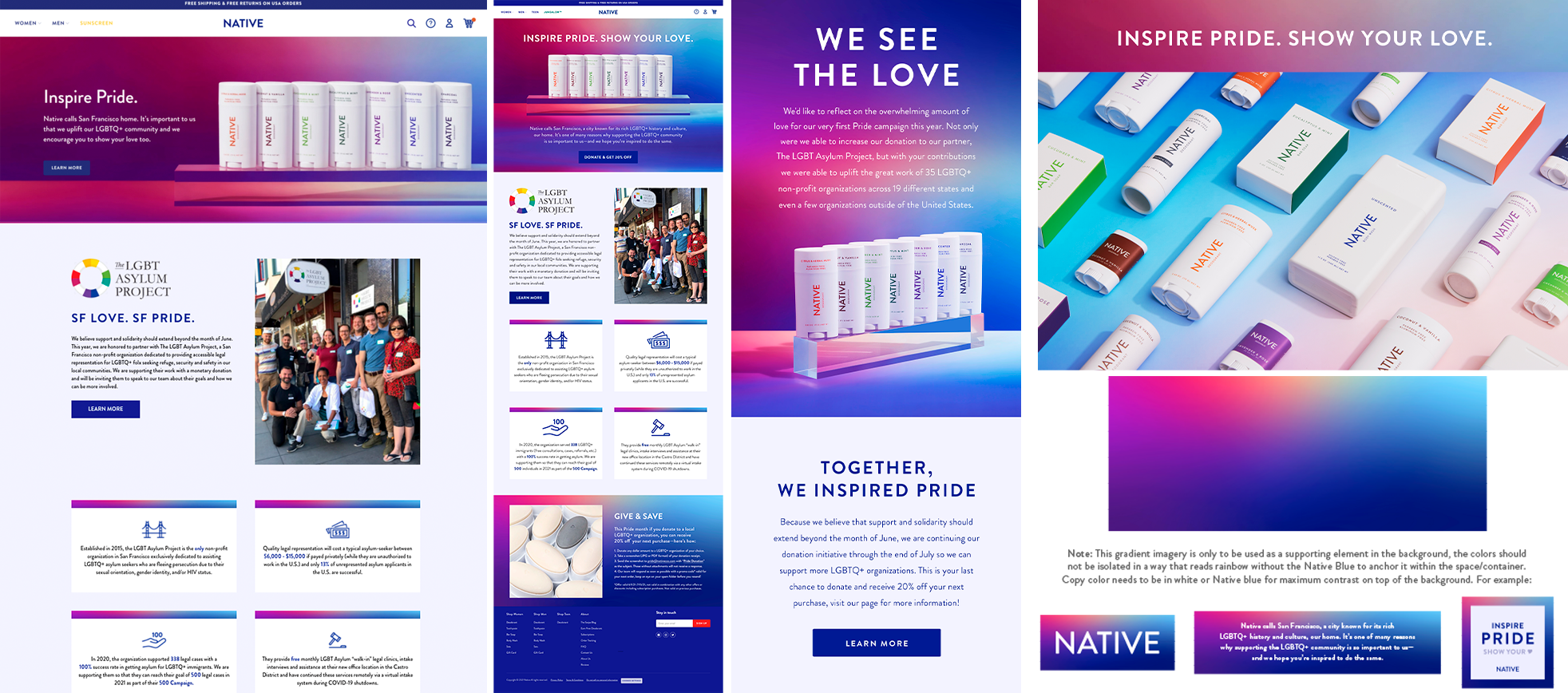
SERVICES - Creative Direction, Graphic Asset Creation, Web Design, Illustration, Color & Composition, Marketing Strategic Planning, Internal Training, Relationship-BuildingMISSION - Native Deodorant understood the backlash of "rainbow washing" as more competitive brands jumped on board the Pride train, and this presented an opportunity for me to lead the creative direction, but most importantly, give back to an LGBTQ+ non-profit in the local San Francisco community.OUTCOME - Leading first with brand authenticity, I developed a soft, soothing, empathetic approach to the existing bright, clean, and minimalist design structure without using literal ROYGBIV swatches. Furthering this in the artwork development of the landing page, marketing activations, and a creative toolkit that aligns with this aesthetic, I also sourced and managed the partnership with The LGBT Asylum Project and featured them on our social channels.IMPACT - We incentivized customers to donate and support LGBTQ+ organizations that directly benefit their local/regional communities and exceeded our initial targeted goal. At the end of July, we closed at about $2000 worth of donations to 50 different LGBTQ+ organizations across the US and a few in Canada and the UK! Because of this success, we were able to double our corporate donation to LGBTAP, along with providing product donations for Pride events to three additional local nonprofits in the Bay Area.PRESS - Post From Founder, Okan Sengun | USAToday | Donate to The LGBT Asylum Project | Drip - 7 of the Best Pride Month Email Examples We've Seen
HOLIDAY 2021 - GIFTS TO SNIFF. JOY TO YOUR PITS.
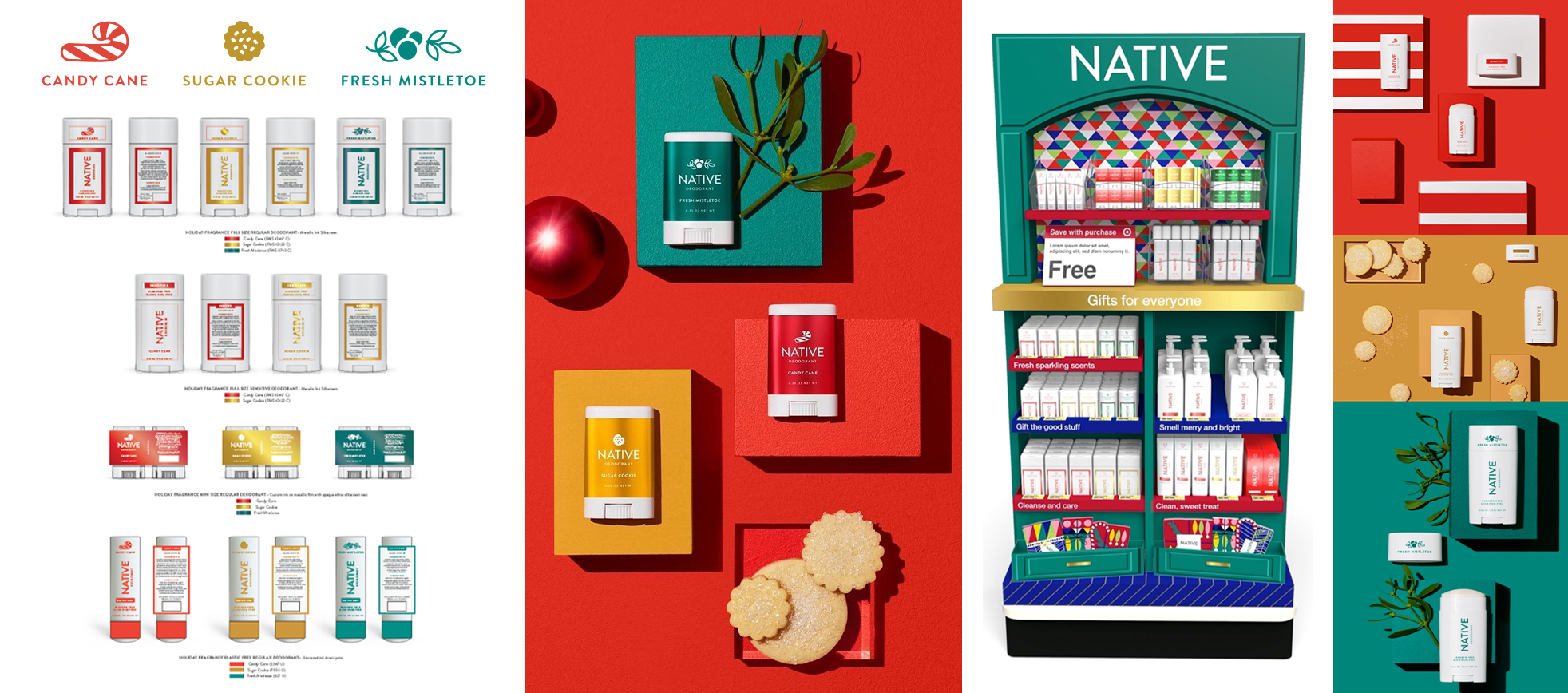
SERVICES - Illustration, Color & Composition, Packaging Design, Print Production, Visual Merchandising Mechanical ProductionMISSION - Native Deodorant envisioned Holiday 2021 to be the whimsical luxury collection that consumers deserved after a year of lockdown.OUTCOME - I illustrated the icons for each of the scents and explored colors that complemented each other and communicated the same relationship across different surfaces (plastic canister, metallic label wrap, and paper tube). Once we hit production for the core packaging, I collaborated with an external creative partner to execute our stunning endcap displays.IMPACT - Expanding from 8 to 23 SKUs, including new development for the Hair Care category, we went from ideation to launch in under one year! Even with strained overseas shipping lead times, we delivered over 1700 endcaps to various Target doors in the US.PRESS - Holiday Scents - Shop Native
HOLIDAY 2019 - ELECTRIC NIGHTS ARE HERE.
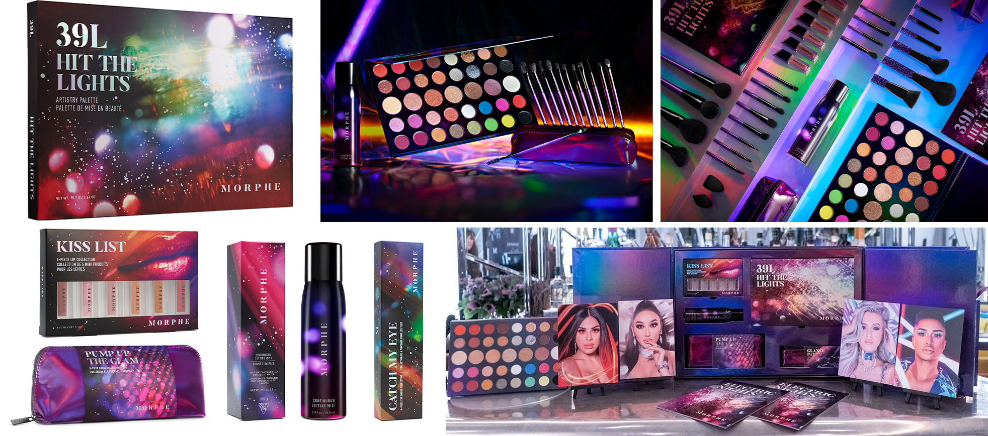
SERVICES - Packaging Artwork Production and Mechanical Execution, Color & Composition, Packaging Structural Design, Prepress Production Management, International Press CheckingMISSION - Morphe Brushes took holiday parties to another level with neons and shimmers within a full 60-piece collection that launched in November 2019.OUTCOME - I partnered with our Senior Packaging Designer to concept how bokeh photography and that dazzling effect to the eye could be elevated. After many rounds of troubleshooting and execution obstacles, we landed on a combination of holographic foils, digital prints on mylar, and metallic inks on shrink-sleeve material. The PR Mailer was super oversized to ensure it would fit all the products and provide ample protection and was accompanied by a beautiful saddle-stitched booklet with foil stamping.IMPACT - The 39L Hit The Lights eyeshadow palette was Morphe's first (and largest) artist-curated product ever executed with limited edition custom decoration. The success of the largest collection to date relied on my close collaboration with numerous international vendors to press check and quality control for consistency. Insights within our marketing channels predicted correctly that this collection was more highly anticipated than our influencer collaborations.PRESS - Unboxing Review - xThuyLe YouTube Channel
This work is licensed under a Creative Commons Attribution-NonCommercial-NoDerivatives 4.0 International License.
© 2025 – ALL RIGHTS RESERVED.